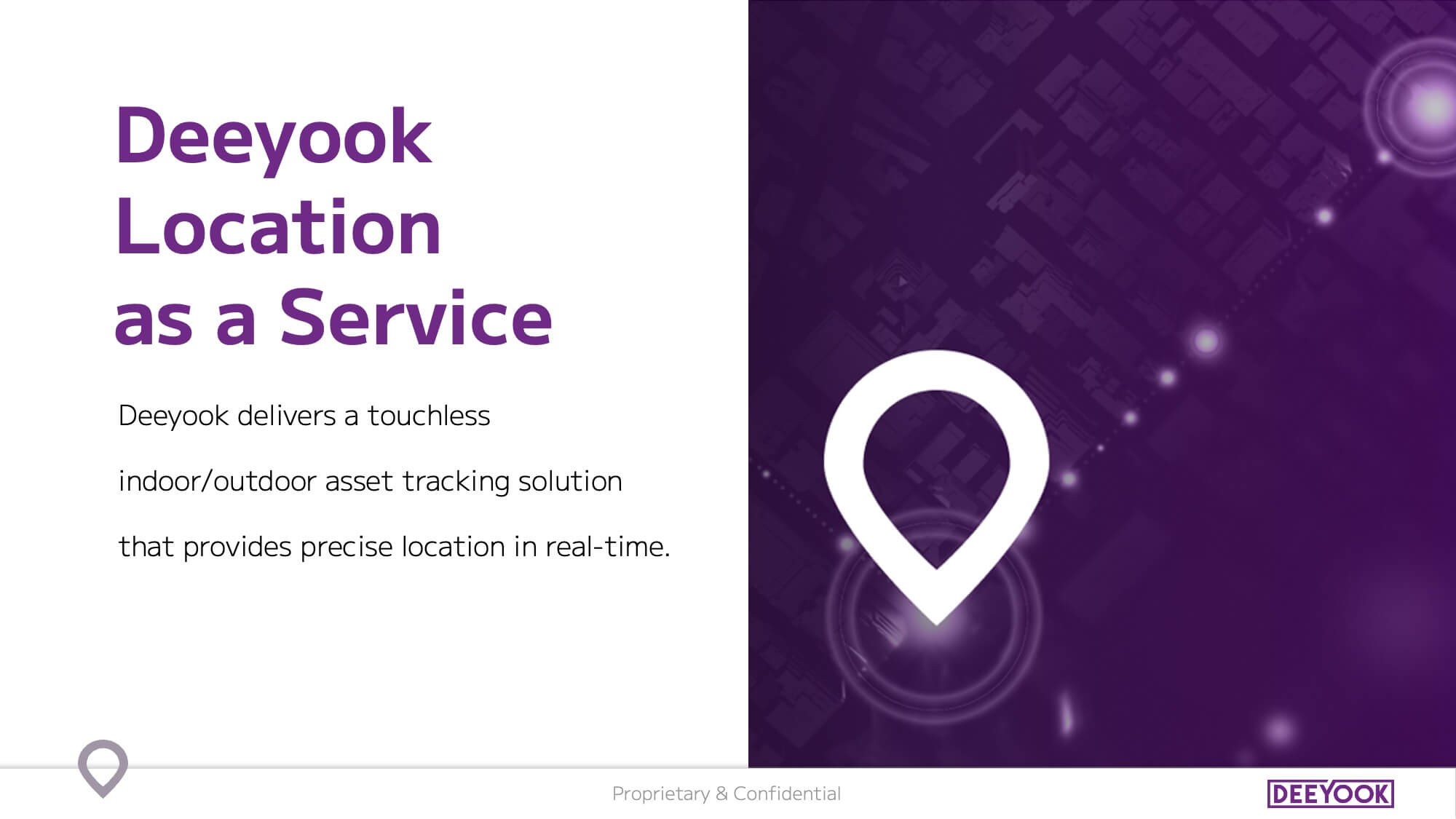
Deeyook is a leader in Location as a Service (LaaS), enabling sub-meter accuracy for asset tracking in manufacturing, supply chain, and logistics. Using existing Wi-Fi networks, Deeyook’s technology offers unmatched visibility without additional infrastructure. Founded in 2019, the company is headquartered in Tel Aviv.
1. Branding
The Branding Process
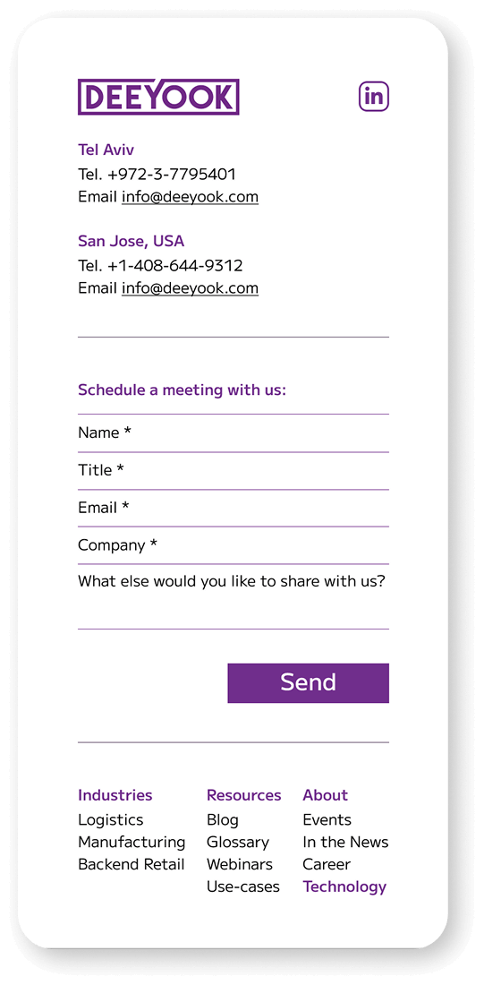
Our branding process for Deeyook focused on creating a unified and impactful identity that aligns with the company’s innovative spirit. We developed a comprehensive brand book, a modern website, and a compelling investor presentation. Additionally, we designed custom exhibition booths for various international events, reflecting Deeyook’s technological prowess and commitment to precision. Each component was crafted to ensure that the brand communicates its core strengths effectively to both clients and investors, while the exhibition booths enhance their global presence.
Icons Strengthen Branding
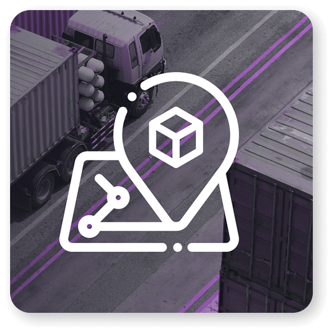
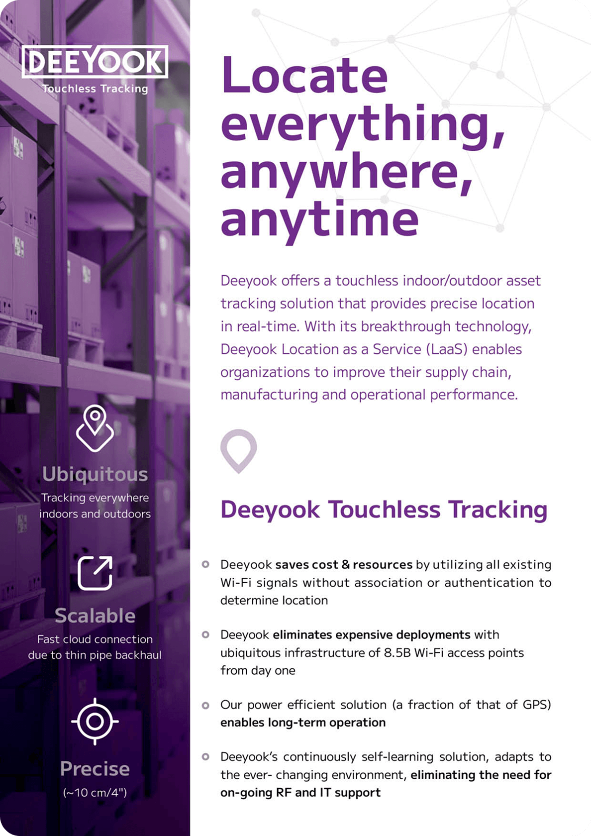
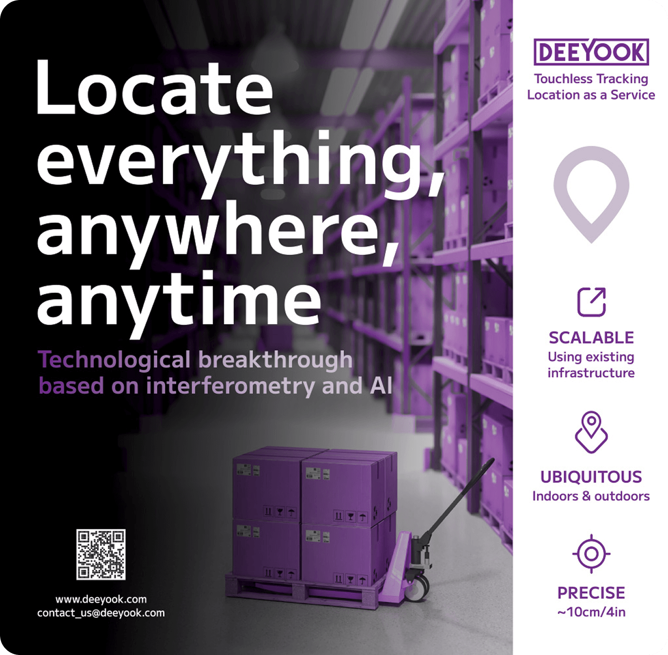
Effective use of custom, modern icons at Deeyook enhances both the brand identity and user experience. These well-crafted icons, tailored to the company’s advanced technology and precision, establish a strong, professional, and clear brand presence. They create a cohesive visual language that improves navigation and reinforces Deeyook’s position as a leader in the location technology sector.
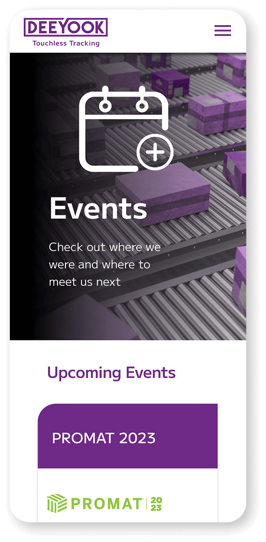
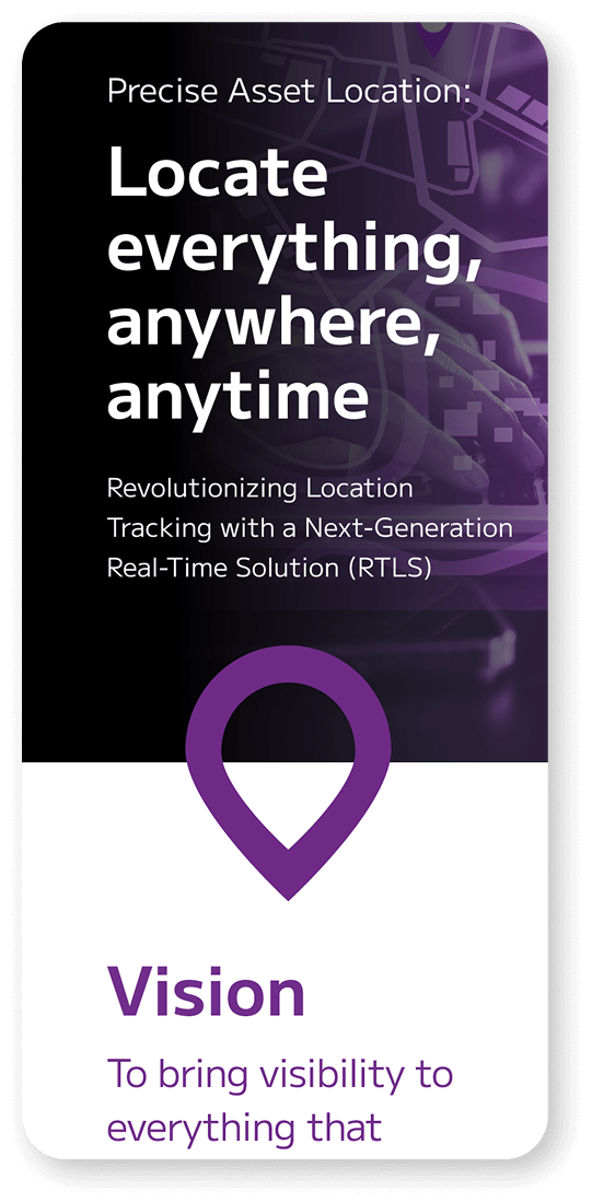
Backgrounds & Icons
As part of the website’s visual language, we used minimalist black-and-white images with touches of the brand’s purple, highlighting the icons and creating cohesive graphics with strong presence.
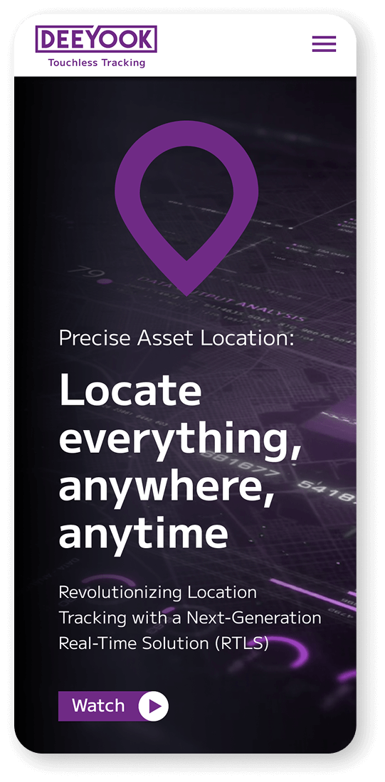
Icon
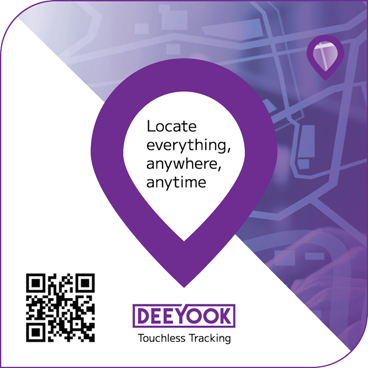
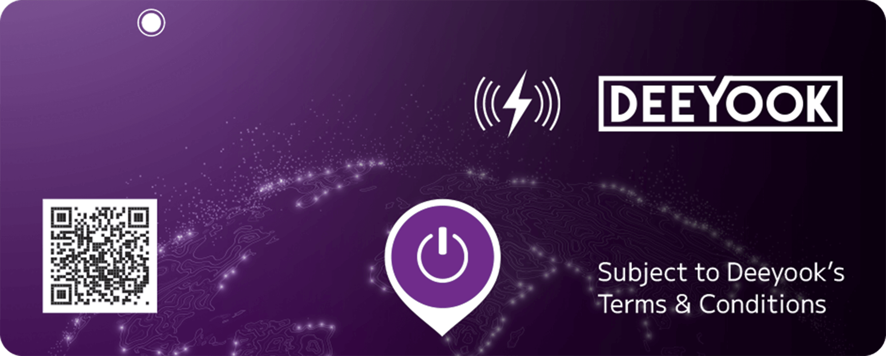
The Deeyook icon, a minimalist and graphic location marker, is strong and clean, connecting the brand to its essence while delivering meaningful, immediate presence wherever it appears.
Color Palette
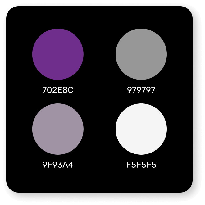
Vibrant Purple and Smoky Lilac define Deeyook’s visual language, conveying technological depth and analytical precision. Soft Gray balances the palette, adding a sense of clarity, innovation, and confidence.
Icon variations
The logo and icon are designed for versatility: they function seamlessly as a pair, and the icon can also be used independently as a stand-alone graphic element across all branding materials.
2. Presentation
3. Print Design
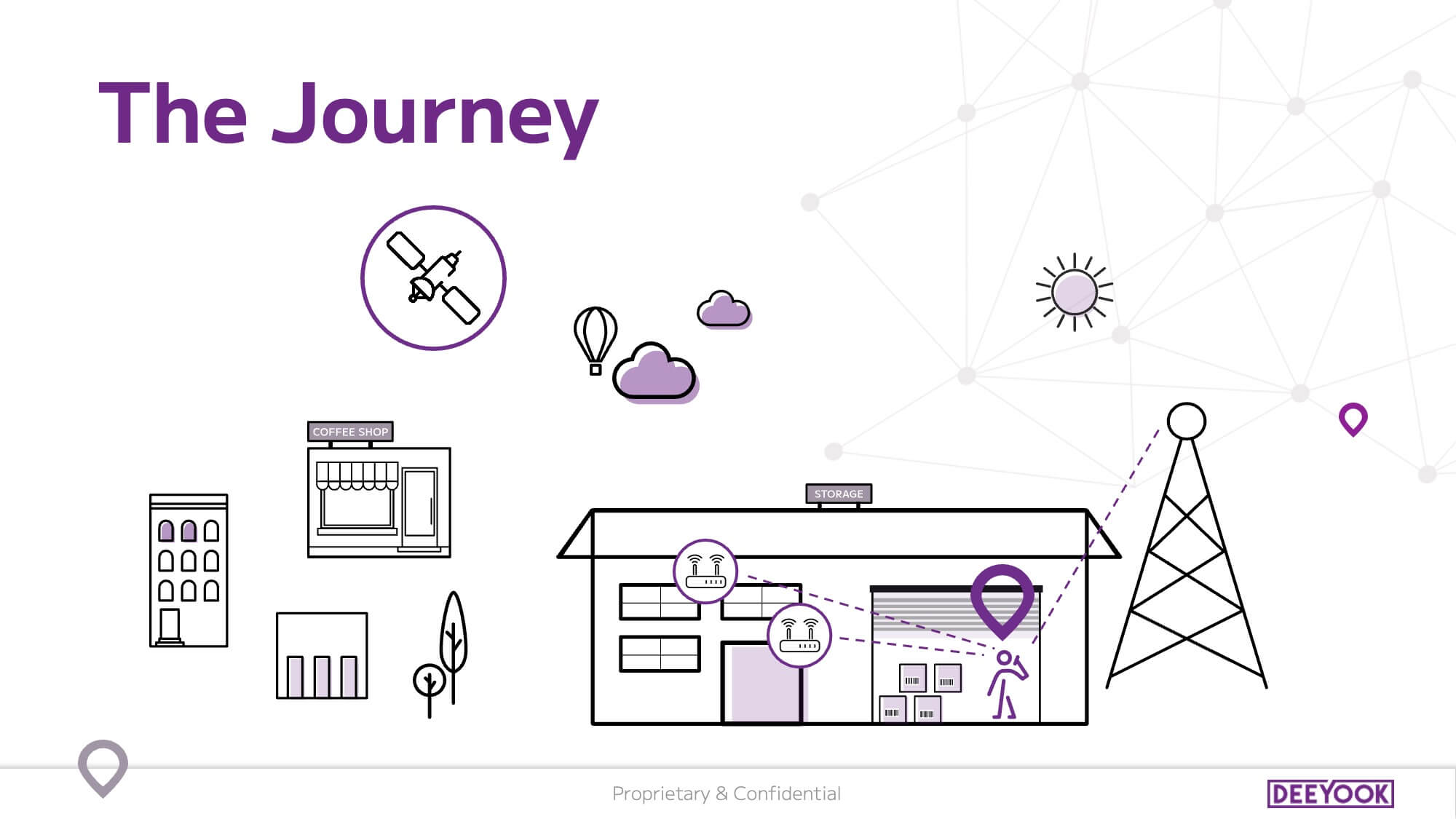
4. Animated Diagram
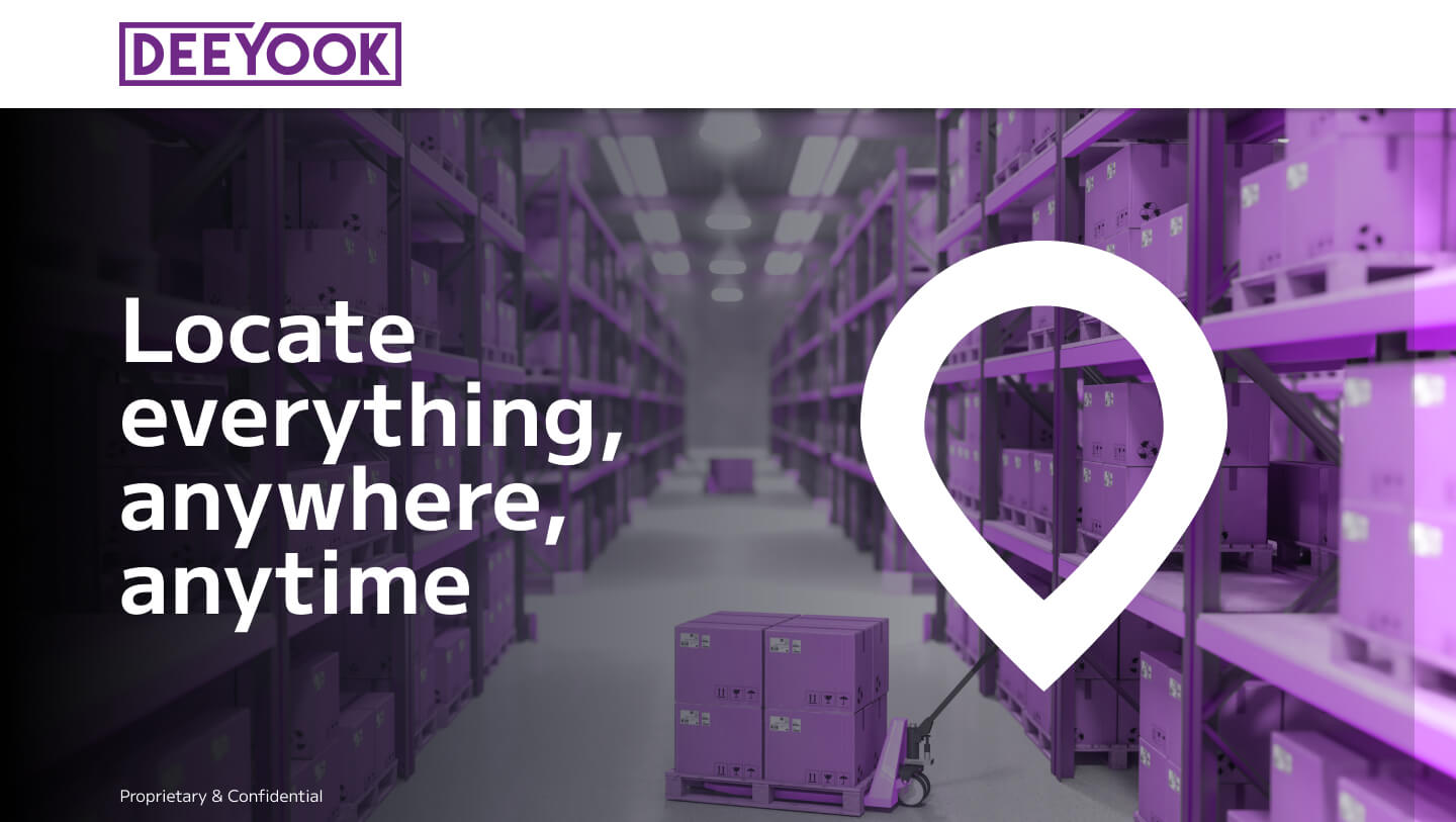
A professionally designed top-view animated diagram that clearly and accessibly presents Deeyook’s essence. The designed diagram introduces the company’s activities and effectively explains the value it offers to its target audience.
More projects
Product Design
Crafting exceptional user experiences for digital products.