Gett (formerly known as GetTaxi) is an Israeli company and an app for ordering taxis and deliveries via smartphone, connecting taxi drivers and passengers with the option to make payments and rate the service. The service operates in Israel, the UK, the United States, and others.
I had the privilege of branding the company during its early years of expansion into Israel, Russia, and London, positioning it as a fresh, innovative, and smart brand. The clean design approach we adopted continues to this day
Bold Launch
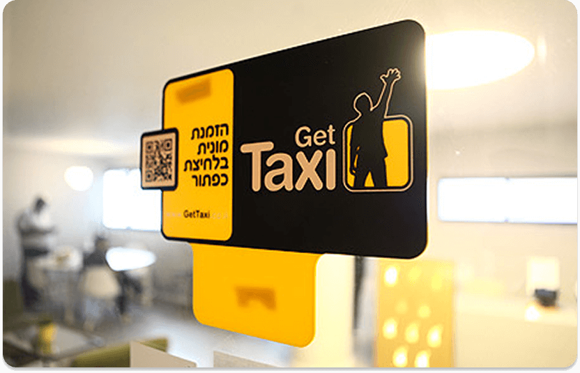
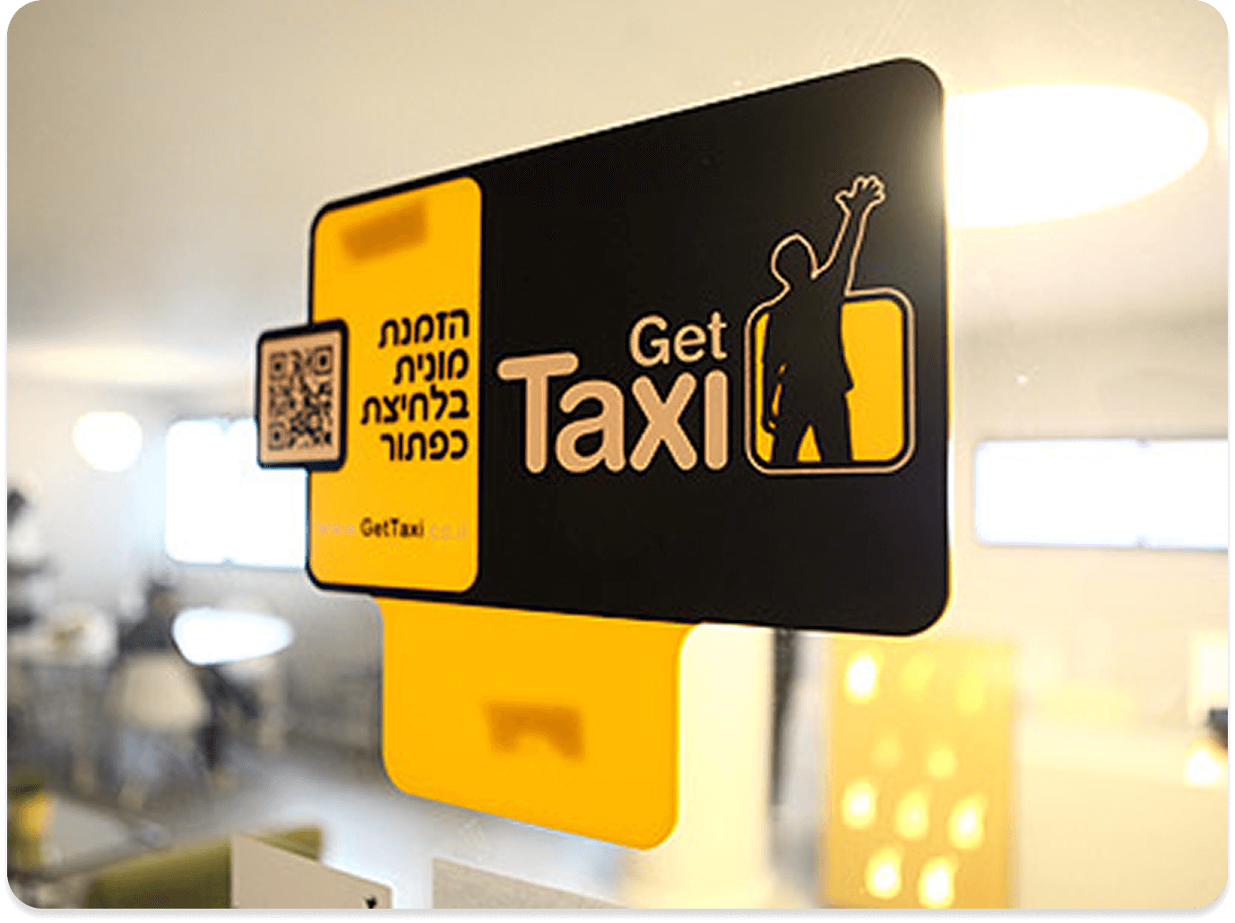
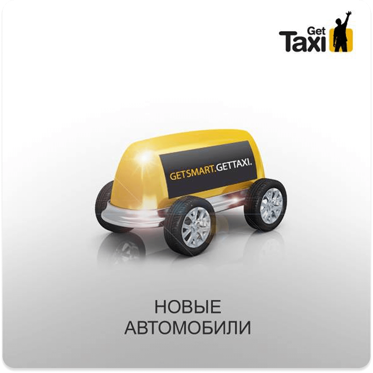
During the initial launch of GetTaxi in the Israeli market, we created a strong, bold, and clean branding designed to make the service unforgettable. The dominant colors yellow and black provided clear, powerful, and immediate visibility across all user touchpoints.
Global Taxi Branding
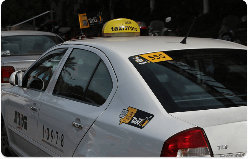
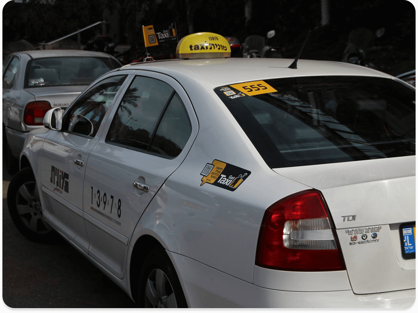
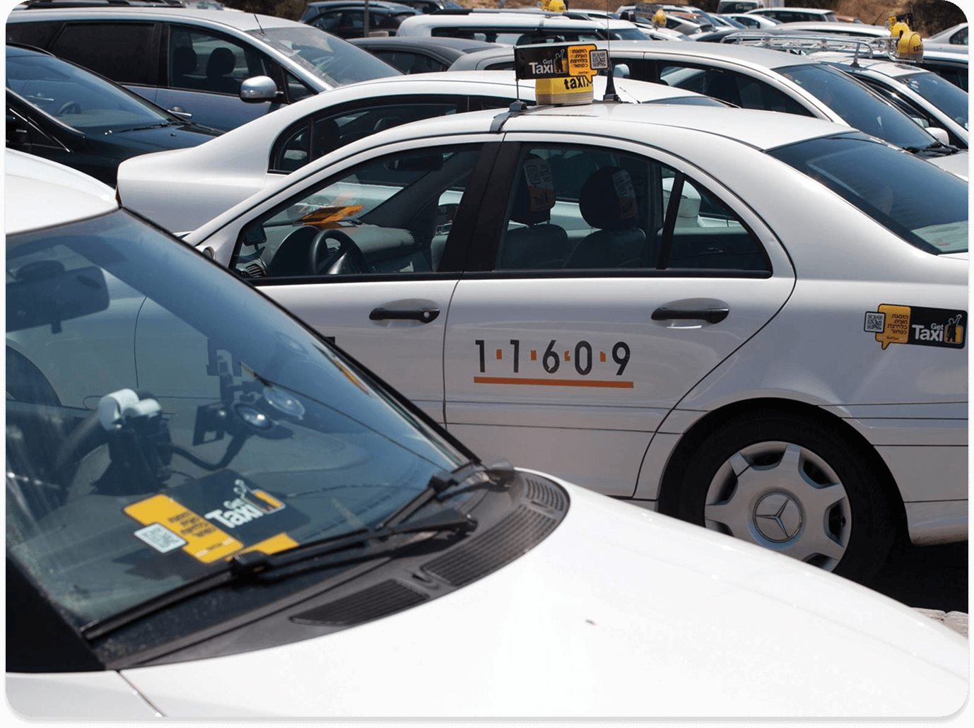
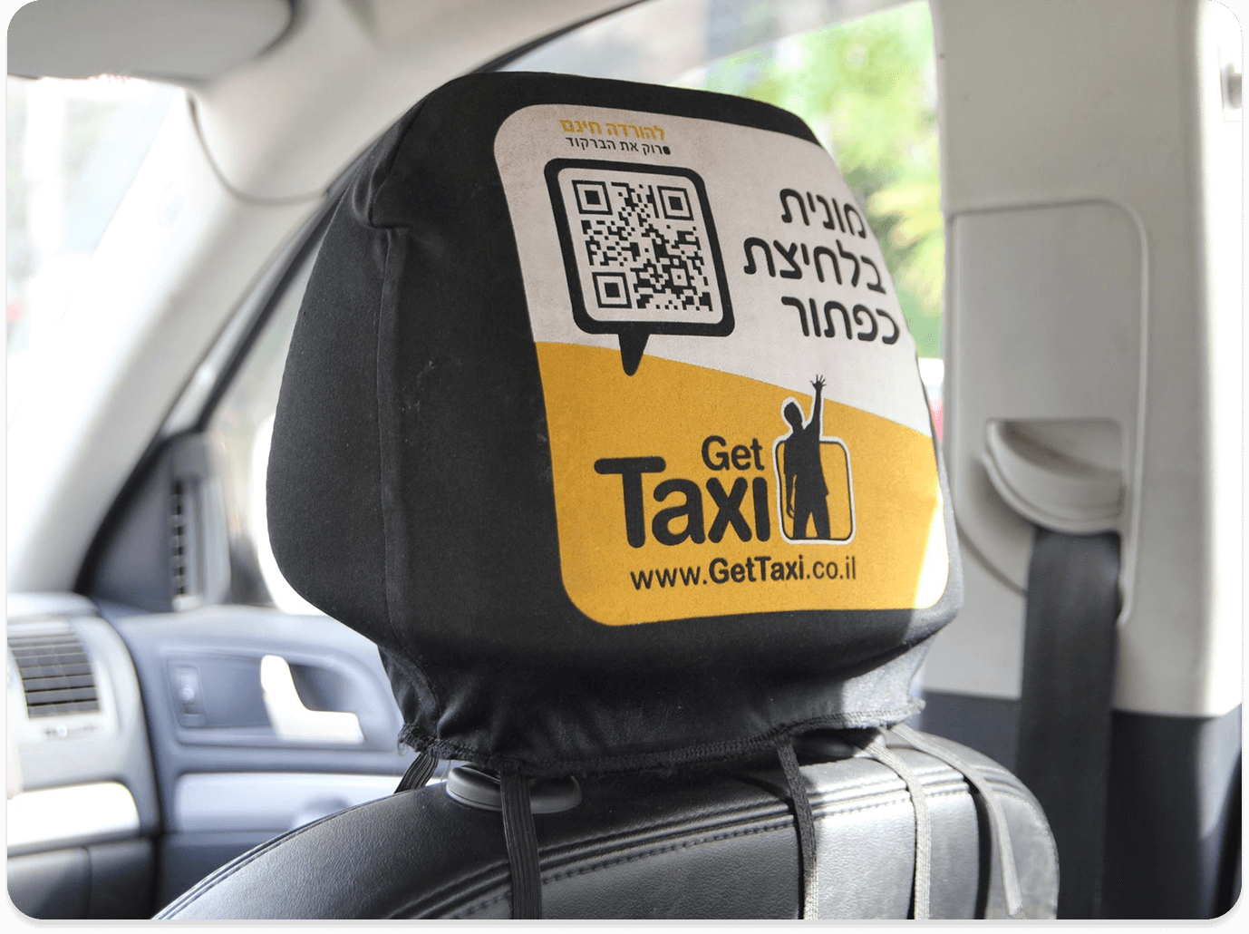
Over the years, GetTaxi became an international brand operating in multiple countries while maintaining a clean, modern design adapted to each market. Additionally, we branded the service taxis themselves according to the brand’s visual language, creating a clear and accessible experience for users.
Refined Global Branding
As the brand grew, we refined its visual identity and extended it consistently across all print and physical touchpoints — from flyers, coupons, taxi flags, and billboards to the taxis themselves. Once GetTaxi became a well-recognized service, we introduced a refreshed look: a cleaner design with white as the dominant color, balanced by precise touches of black and yellow. The result was a cohesive, modern, and instantly recognizable brand presence that strengthened visibility and maintained the bold character of the original design.
Digital Presence
In the digital space, GetTaxi maintains a consistent and clear presence across all platforms, both in Israel and abroad. Icons, colors, and visuals are optimized for digital interfaces, ensuring a consistent brand identity, instant readability, and immediate recognition, connecting audiences to the brand at every touchpoint.
Launch Campaign
A bold yellow-and-black visual identity created an unmistakable street presence, turning GetTaxi into a symbol of innovation, accessibility, and urban visibility.
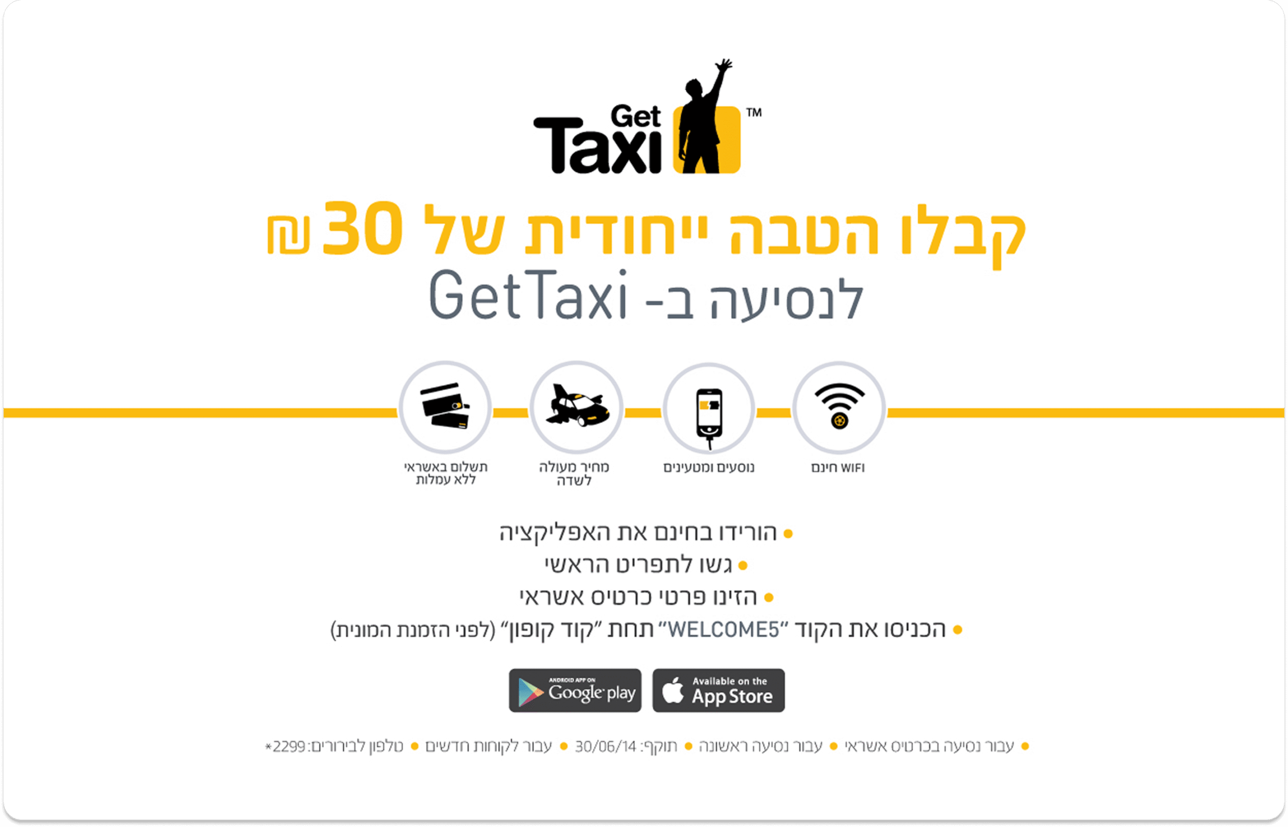
Call to Action
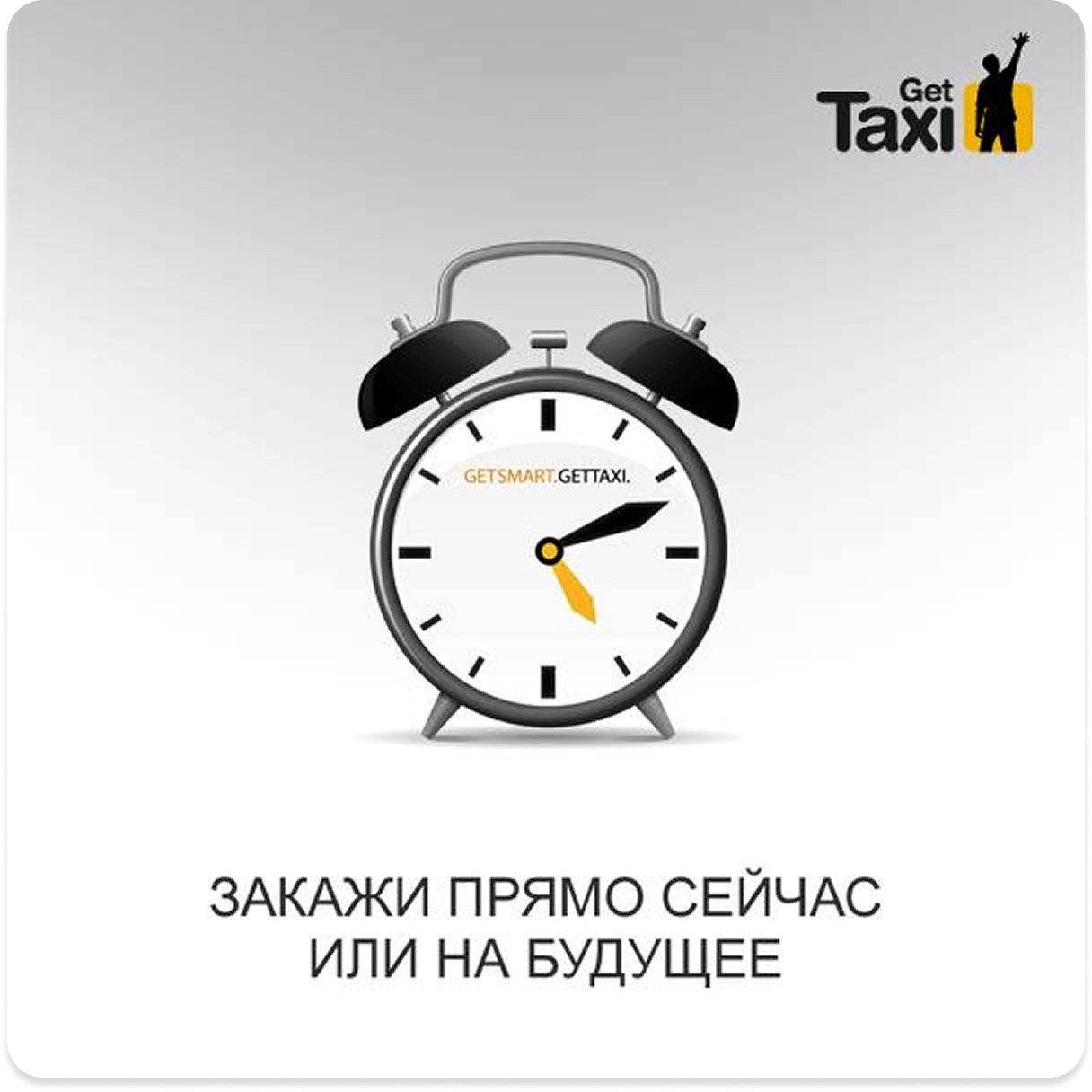
A user-focused campaign designed with a minimalist and sharp visual language, delivering a clear message, an immediate ride at the tap of a button.
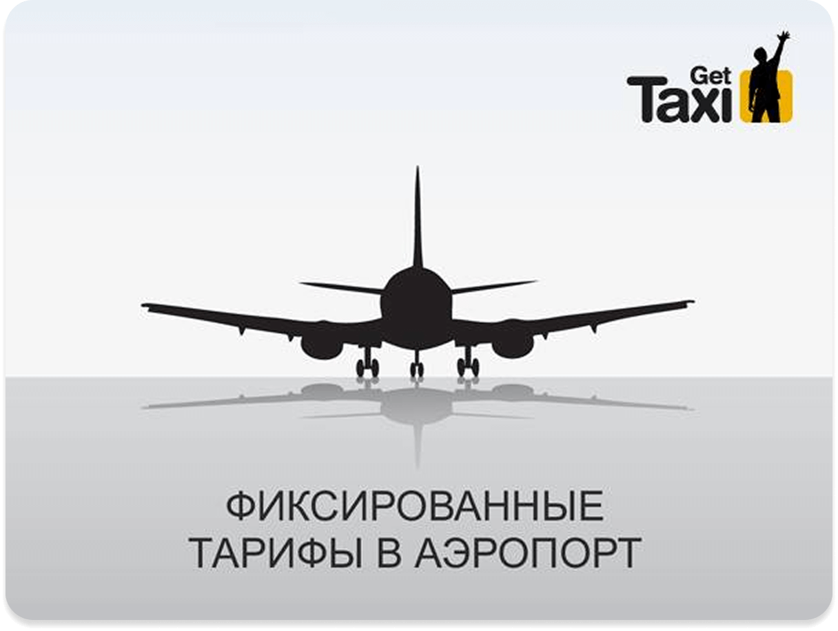
Airport Campaign
Clean design and precise iconography established a strong international presence, conveying trust, stability, and accessibility even in busy airport environments.
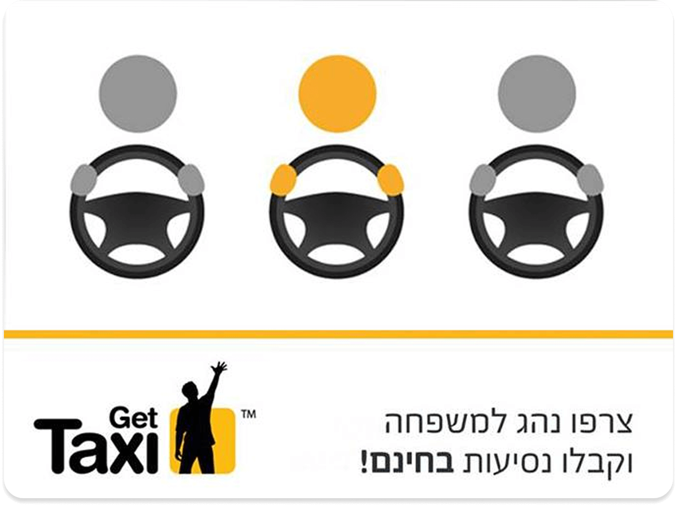
Driver Recruitment
A simple and striking visual language that strengthened the sense of community and human connection between drivers, the brand, and passengers.
More projects
Experience & Logic
Creating exceptional user experiences for digital products that truly resonate.