#Brand design #Brand book #Web design #Infographic #Icons design
About Havayat Harochvim
Glamping at “Havayat Harochvim” blends the beauty of nature with the comfort of a boutique hotel. Located at the entrance to Beit Oren, overlooking the breathtaking Carmel views, our spacious, air-conditioned tents offer a unique stay with full-board dining, seasonal pool, and stunning hiking trails starting right from the site.
Branding
Havayat Harochvim Logo Design
The logo is designed with inspiration from the previous logo, yet presents a fresh, modern interpretation. The clean, rounded typeface partially custom-built, creates a sense of precision and flow. Beside it, a symbol divided into four parts reminiscent of the original structure, features a contemporary twist: a flower shape containing a horse element, reflecting the company’s name. The logo combines simplicity and clarity with modern sophistication, highlighting the brand identity in a fresh and harmonious way.
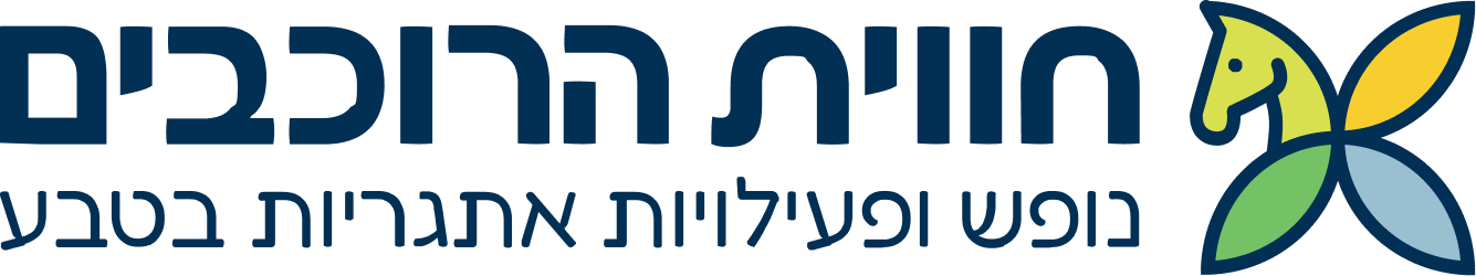
The Logo Icon
The geometric form and clean lines convey power, elegance, and a clear contemporary brand identity.
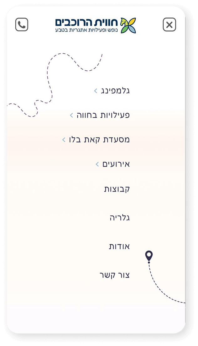
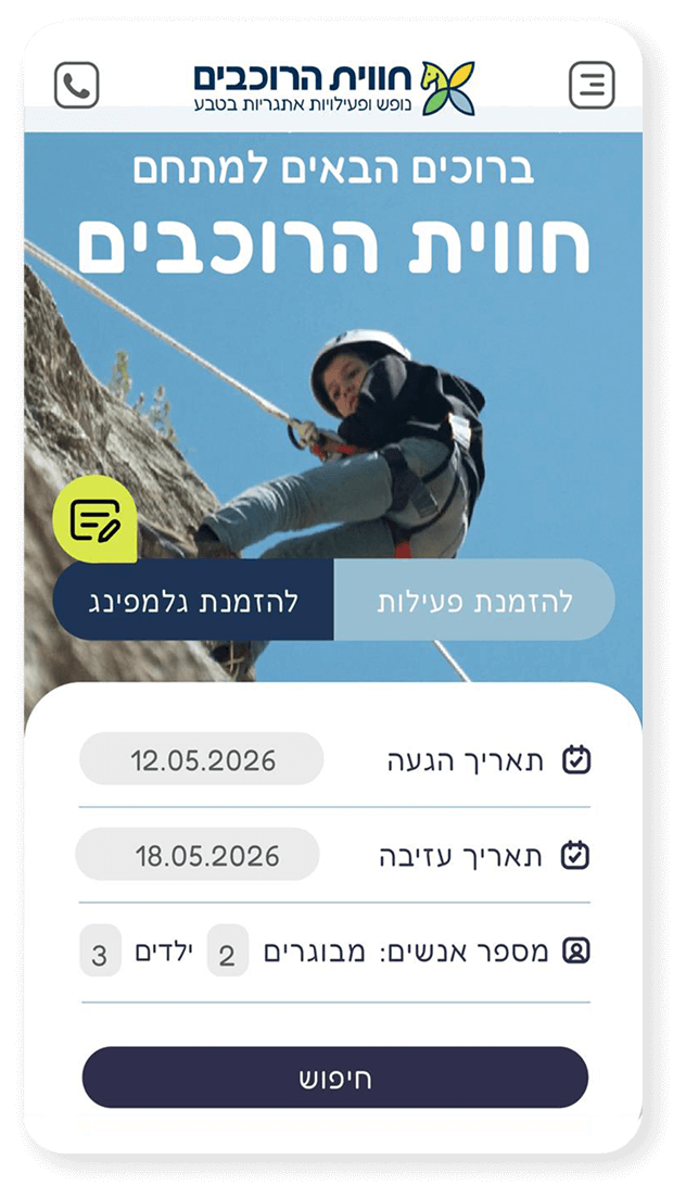
Site Experience
The site conveys the atmosphere and energy, instantly connecting the visitor to the brand and environment.
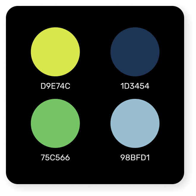
Color Palette
The color palette is inspired by nature and the surroundings: sky blue, sunny yellow, Carmel green and deep blue. It reinforces the brand and atmosphere, connects to open spaces and nature, and provides a clear, precise visual presence.
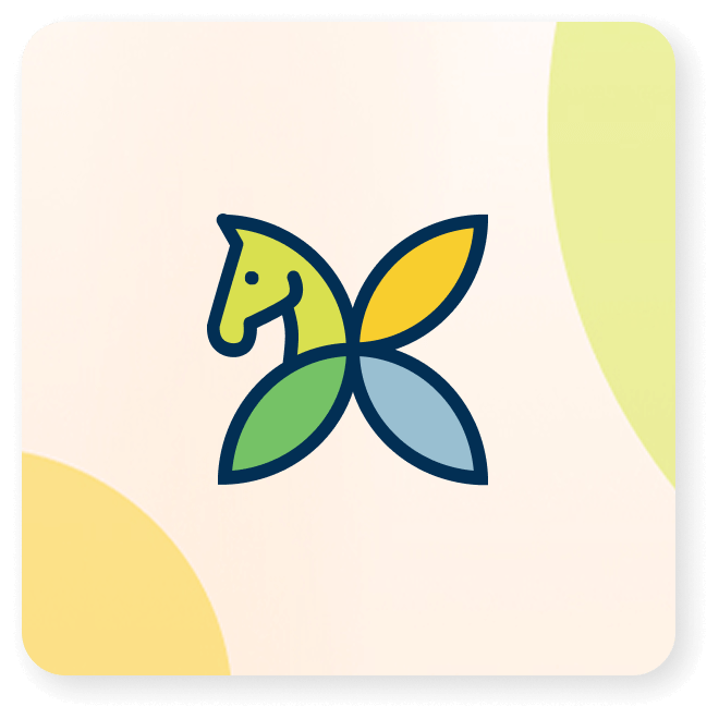
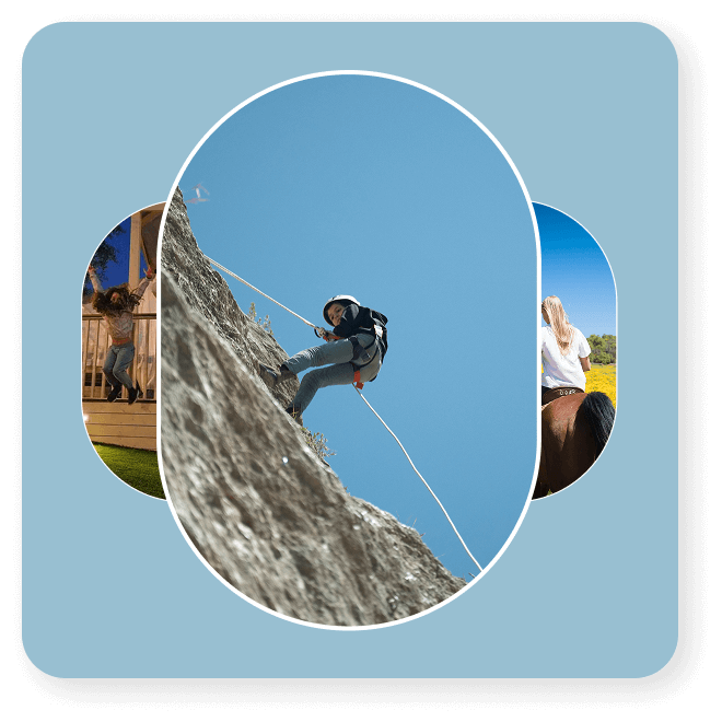
Visual Flow
Images are displayed in a rounded, elliptical layout with connecting lines. The design creates harmony, natural movement, and a seamless scrolling experience.
Icons Strengthen the Branding
The icons on the website were thoughtfully designed and selected, each capturing the essence of the attraction it represents. With a delicate outline or a bold pop of color, they add visual interest and enrich the user experience. Their consistent style blends naturally with the overall site design, bringing a sense of flow, order, and cohesion throughout the browsing journey.
The Branding Process
The website is designed to preserve the natural atmosphere of the location on Mount Carmel, immediately immersing visitors in the sense of nature and adventure. The colors – sky blue, deep navy, green, and yellow – create perfect harmony, while curved, flowing elements accompanying the content evolve as users scroll, adding motion and vitality and highlighting the dynamic and unique character of the experience.
More projects
Product Design
Crafting exceptional user experiences for digital products.