Manna is transforming food delivery with its unique approach. Operating its own kitchen, Manna ensures complete control over meal quality and preparation. Customers can order a variety of dishes via the Manna app, while the dedicated delivery system provides seamless service, acting as both producer and intermediary.
The Branding Process
Manna’s branding process focused on creating a distinctive and impactful identity that aligns with their innovative approach to food delivery. The studio developed a comprehensive brand book and created various print materials, including a series of product labels, a large-scale billboard campaign, and designs for social media. Through careful visual and strategic planning, Manna aims to reflect their core values of innovation, quality, and customer satisfaction in every aspect of their brand identity, ensuring a seamless and engaging brand experience.
Icons Strengthen the Branding
For Manna, we created distinctive and modern icons to represent various aspects of the food delivery experience, along with custom-designed infographics. These elements contribute to a cohesive and impactful visual language, enhancing the brand’s professionalism and clarity. The icons and infographics streamline the representation of Manna’s services and data, strengthening the overall brand identity. This integration ensures easy navigation and a unified visual experience across all touchpoints, making the brand more engaging and accessible to customers.
Urban Visibility
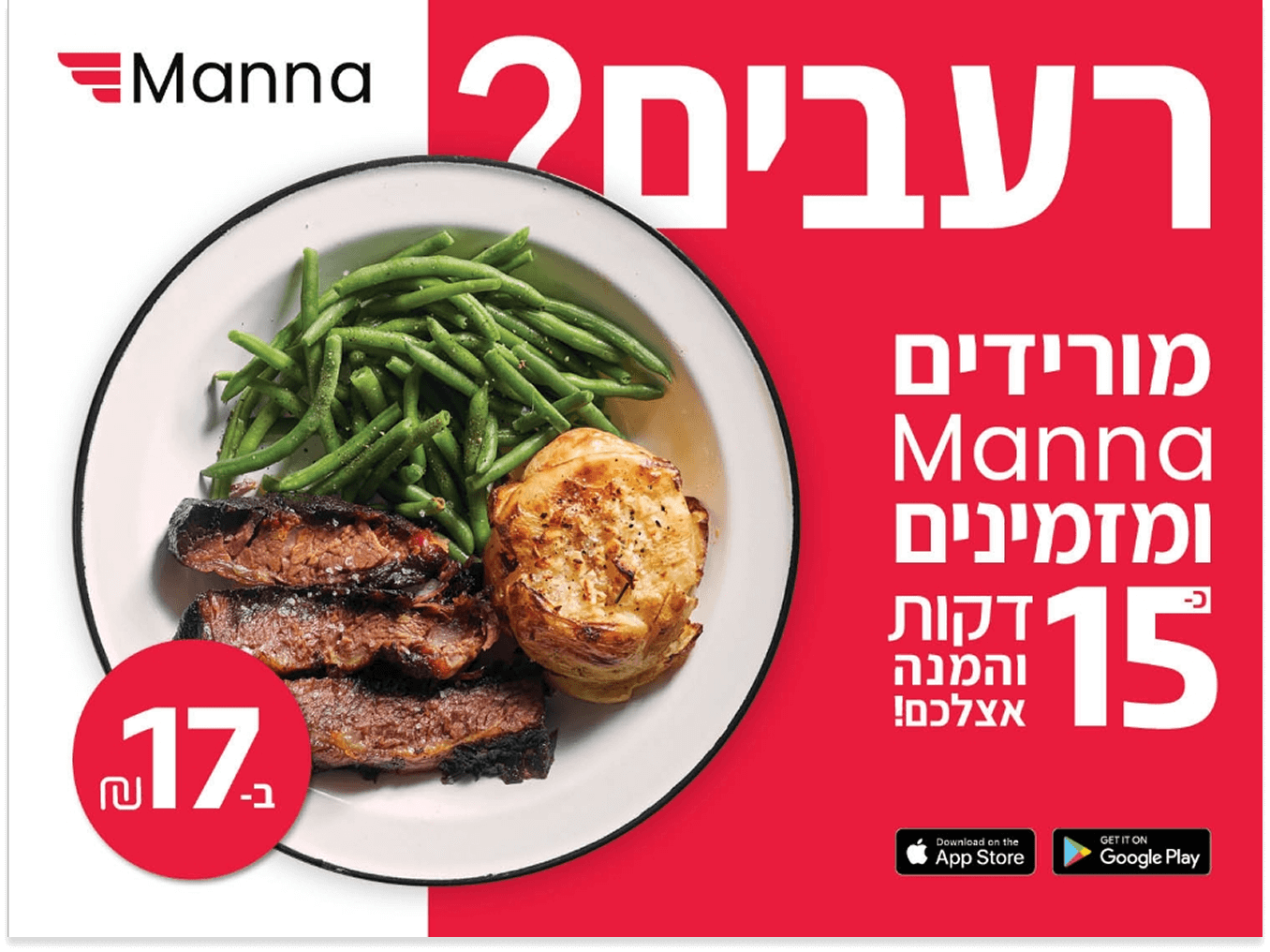
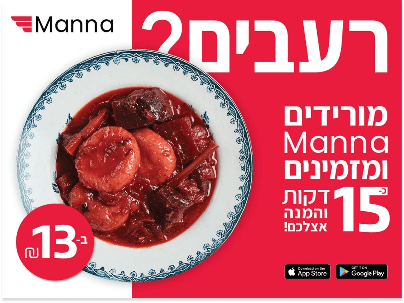
The MANNA outdoor campaign is built on a clean visual language that highlights the brand’s red-white palette and the professional food photography provided by the client. The balance between the appetizing images and precise typography became the campaign’s core motif, creating a clear and action-driven visual experience. This clean approach sharpened the brand identity and turned every billboard into a standout presence in the urban landscape. A sharp, memorable, and impactful outdoor campaign.
Digital Presence
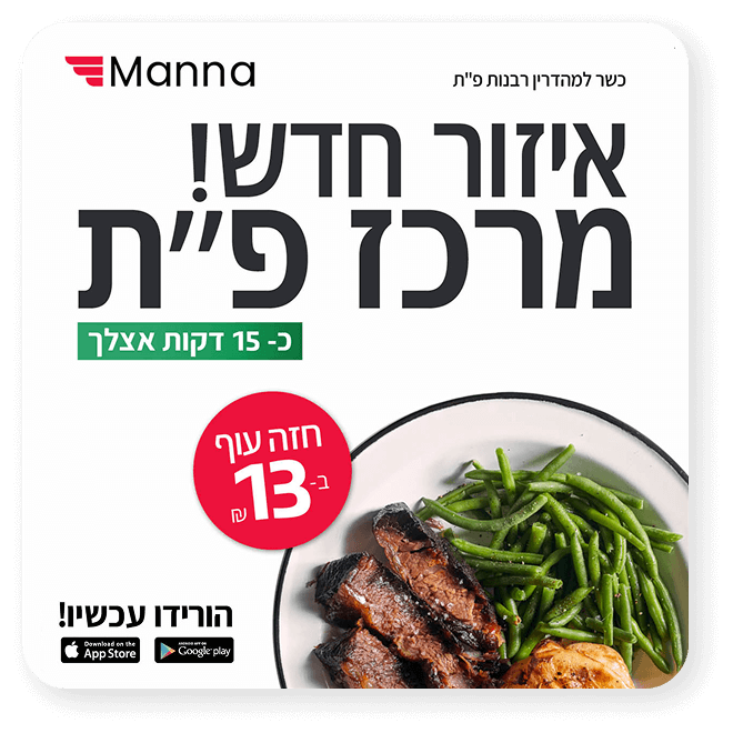
In the digital space, MANNA presents a clean and cohesive brand experience across all platforms. The brand’s signature red–white color palette, enticing food photography, and refined typography are optimized for digital interfaces, ensuring clarity, instant recognition, and a strong visual appetite appeal. Every digital touchpoint reinforces MANNA’s identity and creates a seamless, engaging, and action-driven user experience.
Brand Colors
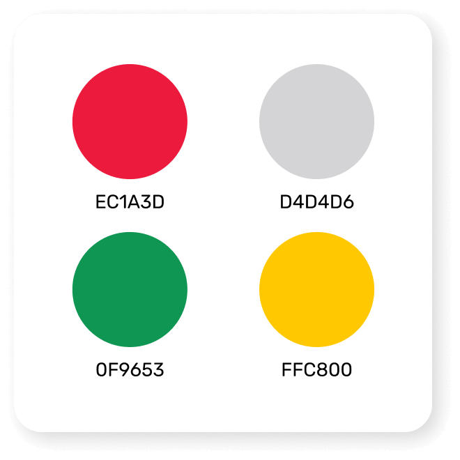
A vibrant palette of red, white, and green defines Manna’s brand identity, conveying freshness, warmth, and appetite. The color system ensures strong recognition and consistency across both digital and print applications.
Graphic Language
A clean, linear graphic style built on simplicity and clarity. Icons and shapes are designed with minimal detail, ensuring a modern and easily recognizable look across all touchpoints.
Social Media Ads
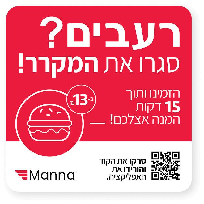
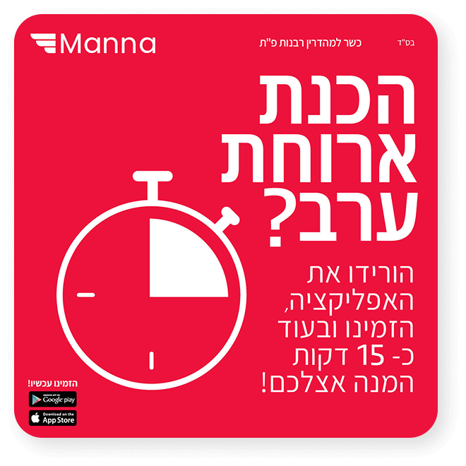
Were designed with cohesive illustrations on a bold red brand background, creating a strong and memorable brand identity.
Launch Campaign
A sharp, action-oriented campaign that combined bold typography, clear iconography, and dynamic color contrasts—translating Manna’s fast and reliable delivery promise into a powerful visual story.
More projects
Experience & Logic
Creating exceptional user experiences for digital products that truly resonate.