Working with Netrise, a development company, we designed and built their website, maintaining a consistent visual language, a clean and minimalist user experience, and highlighting the company’s strengths. The project demonstrates our ability to create professional websites that enhance a brand’s digital presence.
Website
The Visual Power
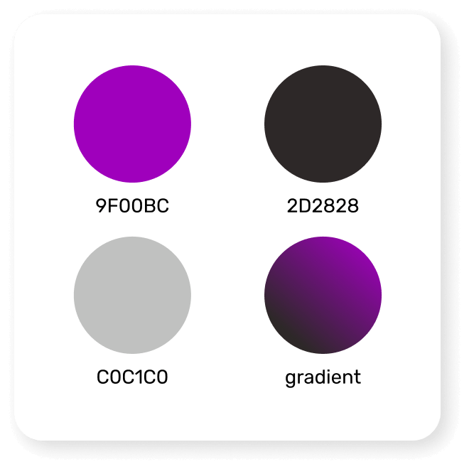
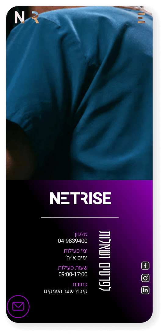
Color Palette
A vibrant and contemporary color palette that sets the brand apart with confident, modern tones.
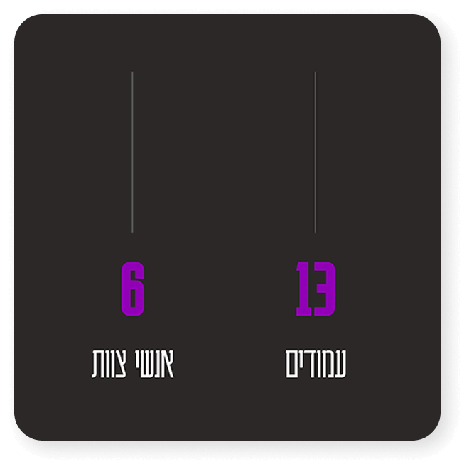
Dynamic Infographics
Clear, powerful infographics updated in real time and tailored for every client, presenting data in an accessible and engaging way.
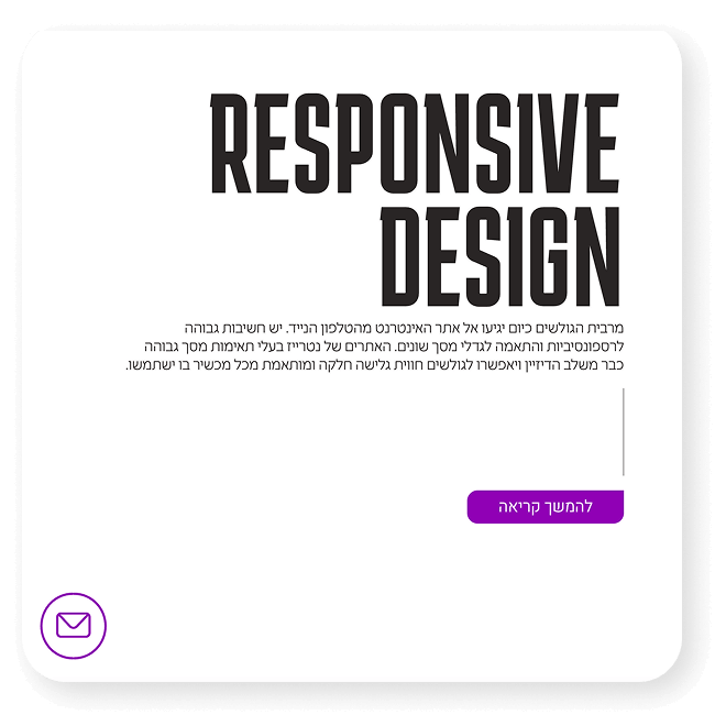
Typography Harmony
A mix of varied sizes and colors creates a precise typographic balance that feels modern, structured, and visually engaging.
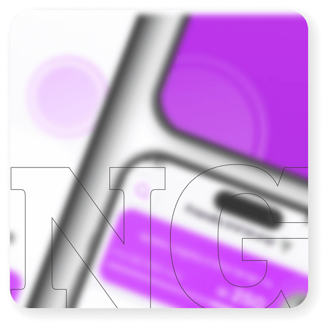
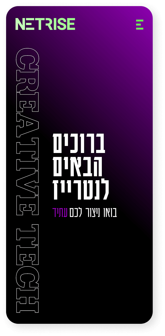
Outlined Typography
Fine typographic outlines flow across the site, adding layered depth, subtle movement, and a harmonious visual rhythm.
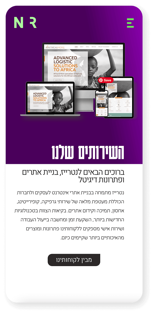
Clean, Modern Design
The design of Netrise’s website is built around a precise, modern, and clean visual language that reflects the company’s DNA and its professional approach to the digital world. A combination of warm, bold colors, smart typography, and subtle outline elements creates a clean yet layered experience with depth and movement. The simple, well-crafted icons strengthen the story of each service and present complex information in a clear and accessible way. Together, they create a fresh, innovative, and intuitive user experience.
More projects
Product Design
Crafting exceptional user experiences for digital products.