Powerball offers flexible and innovative workspaces that combine a high-quality work experience with meticulous design and attention to every detail. The offices and shared spaces are tailored to the needs of growing businesses, featuring flexible leasing options, a thoughtfully designed environment, and a strong sense of community that allows teams to focus on what truly matters – success. The website design reflects the brand values of innovation, originality, reliability and elegance, translating them into a clean, modern and inspiring visual language.
Website
The Visual Power
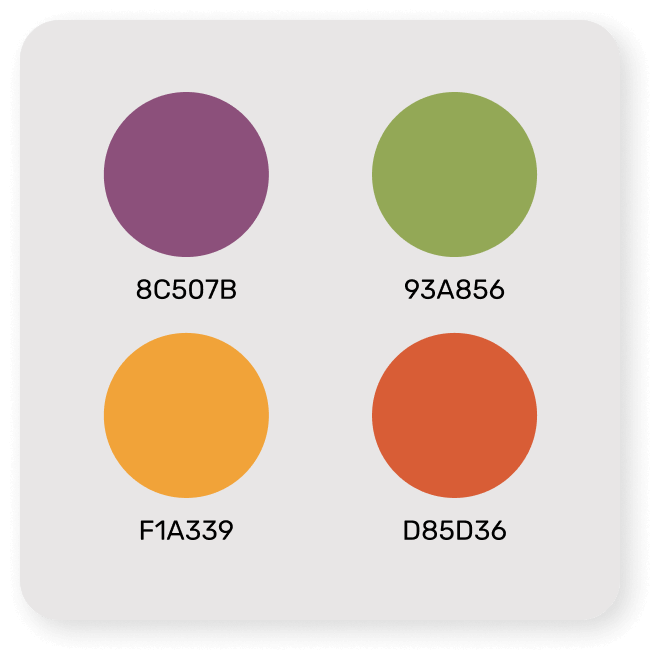
Color Palette
Warm shades of green, purple, orange, and red give each area a unique identity while keeping the site clean and vibrant.
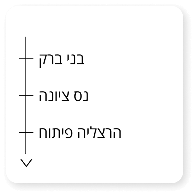
Quick Navigation
A floating menu was added to enable easy navigation from any page and provide quick access to the reservation form.
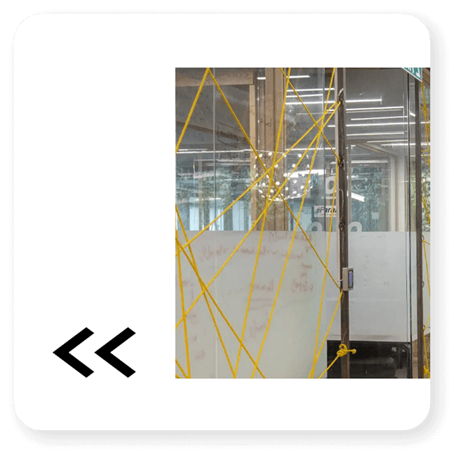
Direction & Flow
Bold black graphic arrows enhance the flow of the site and guide the user naturally and intuitively.
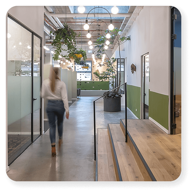
Powerful Images
Striking images of the client’s stunning locations take center stage on the site, enhancing the experience and local atmosphere.
Icons Strengthen the Website
The icons on the Powerball website are meticulously designed to provide a clear visual representation of the company’s strengths, while maintaining a clean and consistent graphic language. Icons make complex information accessible and easy to understand, highlight key services, and create a rich visual experience that reinforces the company’s professional branding.