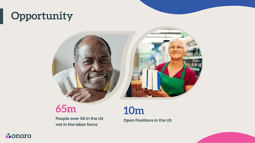
Onoro is a mission-driven technology company established to engage experienced older adults in a compatible workforce. Their platform is built on the core belief that their years of professional and life experience are an invaluable asset.
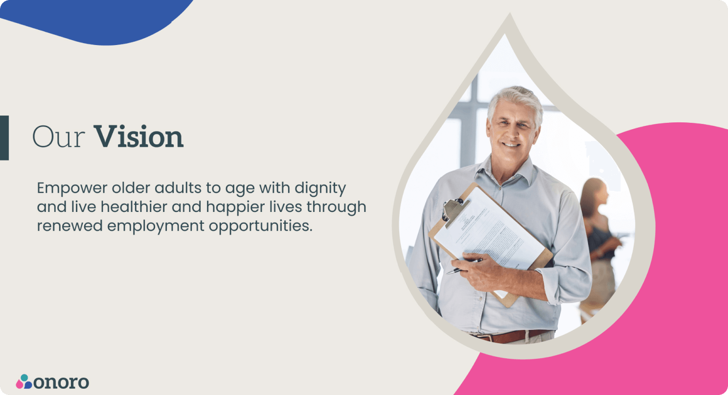
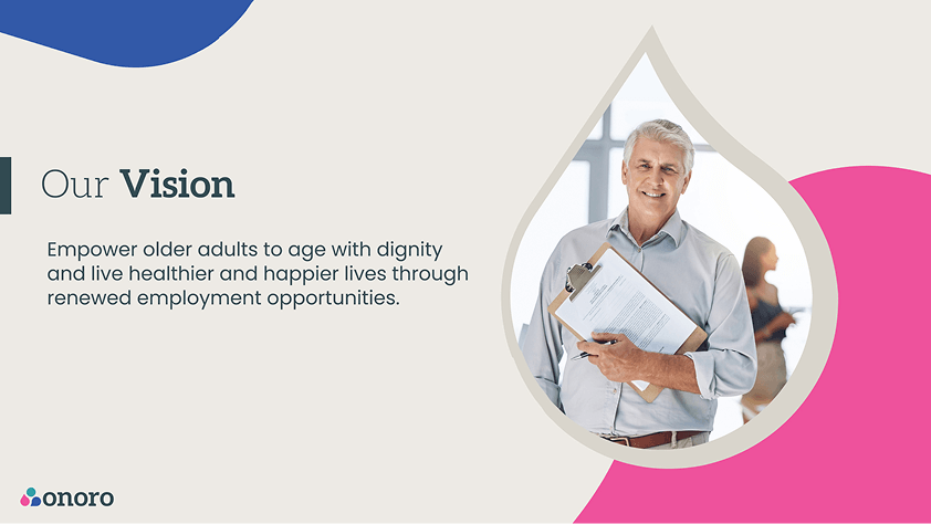
By leveraging intelligent algorithms, Onoro’s primary objective is to empower older adults to age with dignity and live healthier and happier lives through renewed employment opportunities and provide the secure, flexible bridge required to connect them with forward-thinking organizations.
1. Branding
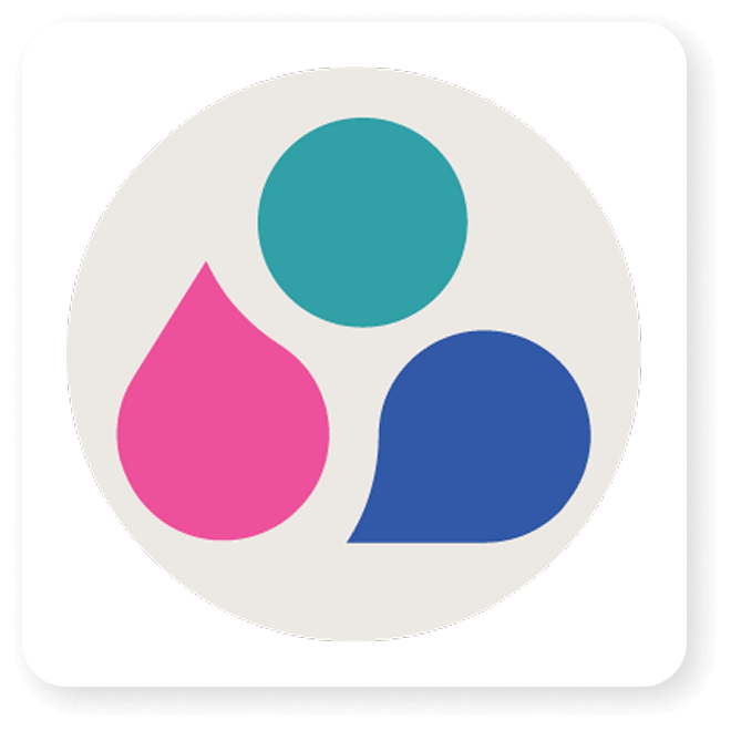
Onoro Logo Design
The Onoro logo features an icon comprised of three interconnected elements. The two lower drops (Pink for the worker and blue for the employer) subtly suggest overlapping speech bubbles, emphasizing clear communication and the exchange of needs.
Their convergence leads to the upper teal circle, symbolizing the Onoro Platform itself: The point of technological singularity where the optimal match is achieved. This integrated design visually represents the synergy, innovation, and dynamic growth fostered by connecting these two vital parties.
Branding Elements
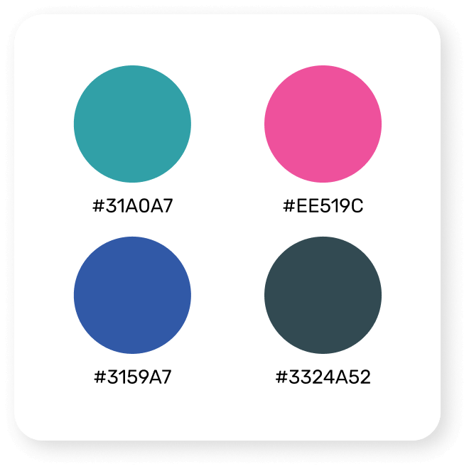
Color Palette
The chosen palette of vibrant teal, deep blue, and warm pink was carefully selected to convey both technological sophistication and a human-centered, optimistic approach.
Graphic Elements
The iconic three-part symbol is used as a key design element, subtly integrated into the backgrounds to reinforce the platform’s communication, growth, and singularity.
Typography
The custom wordmark utilizes a typeface that is modern, highly legible, and approachable, reflecting both professionalism and trust in its innovative service.
Image Style
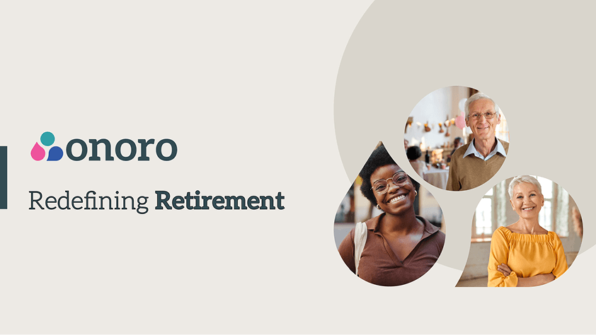
The style incorporates diverse, authentic photography of older adults to reinforce the brand’s empathetic, human-centric mission and optimistic vision.
2. Presentation
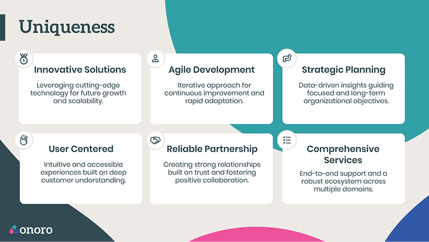
The Onoro presentation employs a visual style that is optimistic and professionally trustworthy. The design is defined by soft, organic shapes and a distinct three-color palette (deep teal, vibrant pink, and bright blue). Asymmetrical background shapes create a subtle dynamic flow that prevents visual stagnation. This design choice, combined with a consistent structure and the use of diverse, positive imagery of older adults, successfully makes the important, “deep” subject matter feel engaging, accessible, and honorable without being heavy.
Summary
The central design challenge for Onoro was establishing a visual narrative that could bridge the sensitive nature of the subject, empowering the 55+ demographic, with the need for a sophisticated, high-tech, and investable solution. The primary goal was to create an honorable and optimistic tone that avoided the pitfalls of clinical seriousness or kitsch sentimentality.
This tension was resolved by balancing the clean aesthetic of modern technology with human warmth: using the brand’s calm teal and professional blue to convey high-tech capability, complemented by the vibrant pink and dynamic, organic shapes to reinforce the human-centered mission. This fluid visual system ensured a cohesive, engaging flow that made a tough subject feel progressive, empathetic, and genuinely interesting.
More projects
Product Design
Crafting exceptional user experiences for digital products.