Looma is a Creative and Marketing Agency founded by Teri Perver, who brings over 20 years of experience in marketing, creative direction, and managing growth processes.
Looma works with organizations, startups, management teams, and internal teams during periods of growth and change. They specialize in providing comprehensive solutions underpinned by a unified and strong marketing strategy.
1. Branding
Looma Logo Design
We took the existing design from the previous brand and aimed to preserve its atmosphere and style, adapting it to the new company name: “Looma” (transitioning from “Teri Perver”). The arrow motif, which comes from the original design, was graphically refined and adapted to connect with the letter ‘M’. This element symbolizes digital presence, modernity, movement, and process-oriented thinking.
Previous logo
New Logo
Branding Elements
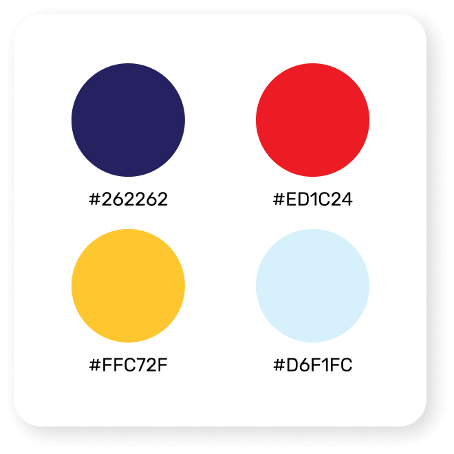
Color Palette
The core color palette is anchored by the original deep purple and red, which are now energized by the addition of a vibrant yellow to signal modernity and a forward-thinking approach.
Graphic Elements
Simple, foundational graphic shapes based on circles and squares were used to create a playful puzzle, symbolizing sophistication and engagement
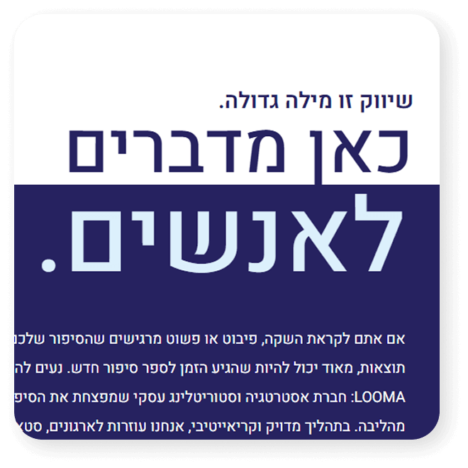
Typography as a Visual
Strong and prominent lettering is utilized to replace traditional imagery. The messaging itself is transformed into a primary source of visual interest.
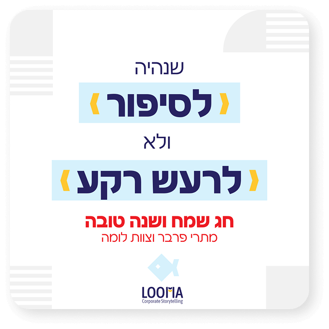
Marketing Style
The style is primarily typographic and image-free, relying on a clean layout. Custom icons inspired from the core graphic elements complete the look.
Infographic
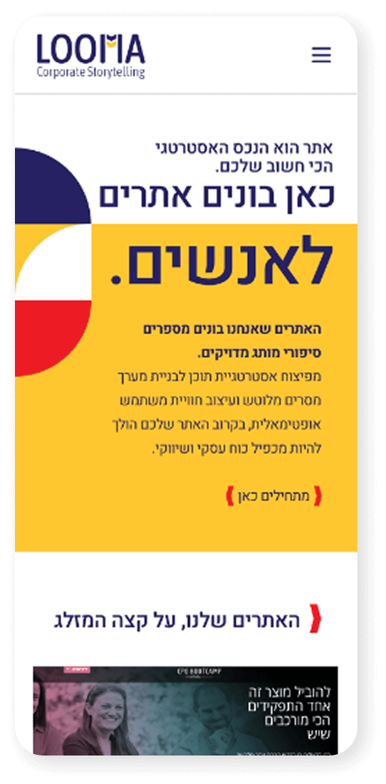
2. Website
Creating the Website
The website creation process began with an audit of the existing site and its content. We decided which elements to retain and which atmosphere best suited the client.
Following the brand refresh, the newly added yellow accent color took on a significant role in the website’s design. Additionally, dynamic layout breaks formed the basis for a corporate website design that, much like its owner, is anything but conventional.
Summary
The Looma project successfully refreshed and consolidated the brand identity, merging Teri Perver’s extensive experience with a modern, process-oriented visual language. The new brand elements—particularly the playful puzzle graphics and the vibrant yellow accent—were then seamlessly integrated into a dynamic and unconventional website design, resulting in a cohesive and forward-thinking digital presence.
More projects
Product Design
Crafting exceptional user experiences for digital products.